

The Opportunities Dashboard in TeamGram CRM offers a powerful overview of your sales activity, with three main sections: Pipeline Status, Closed Opportunities, and Individual Metrics.
In this post, we’ll focus on the Pipeline Status section and explore what each widget reveals about your sales process—and how to act on that insight.
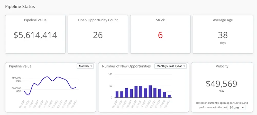
Pipeline Value
This metric shows the total estimated value of all currently open opportunities.
Keep in mind that these are estimates—especially in early stages where some deals may not yet have defined values. If your pipeline value is lower than usual, it could indicate a future slowdown in closed deals. That’s your cue to ramp up lead generation and start filling the early stages of your pipeline again.
Pro tip: Click the number to see exactly which opportunities are contributing to this total. The data reflects your current selection filters.
Open Opportunity Count
This shows the total number of open opportunities in your pipeline.
A declining count may also signal trouble ahead. Without enough deals in motion, even a strong win rate won’t sustain your sales targets. If the number looks low, it’s time to generate more leads and uncover new opportunities.
Pro tip: Click to see the list of these opportunities. As with all widgets, this reflects your current filters.
Stuck Opportunities
This number highlights how many open opportunities have remained in the same stage beyond the time limits you’ve defined.
Stuck deals can clog your pipeline, drain your team’s time, and skew your forecasting. Identifying and addressing these opportunities early helps keep your pipeline flowing and your close rates healthy.
Average Age
This shows the average number of days your current open opportunities have been active.
Compare this with your average time-to-win. If the average age is significantly higher, you may have too many stale or low-probability deals taking up space. Consider reviewing and possibly closing opportunities that are unlikely to move forward, so your team can focus on higher-potential ones.
Pipeline Value Over Time
This historical chart shows how the total estimated value of your open pipeline has changed across time periods.
As deals progress and mature, their value estimates typically become more accurate. That’s why we use the most recently updated value for each opportunity throughout its lifecycle in this chart. Keep in mind that values shown for past periods may differ from what was originally forecast at the time.
Number of New Opportunities
This chart tracks how many new opportunities were created in each time period.
A consistent inflow of new deals is critical to sustaining long-term sales. Drops in this chart are early indicators of trouble down the road—so act quickly when the numbers start dipping.
Pipeline Velocity
This metric estimates the average value of deals you can expect to close per calendar day, based on your current win rate and opportunity values.
You can adjust the time window to smooth out temporary fluctuations in performance. This is one of your most useful forecasting tools—it shows not just how full your pipeline is, but how efficiently it’s converting into revenue.
Conclusion
Your Pipeline Status metrics aren’t just numbers—they’re early warning signals, performance indicators, and action guides. With TeamGram CRM, you don’t have to guess where things stand. You can see it, click into it, and take action—all from one place.