
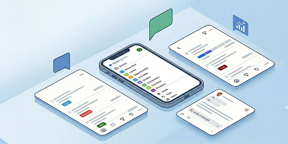
With a brand-new foundation and a fully redesigned interface, the new TeamGram Mobile is now faster, easier to read, and built for effortless one-handed use.
The new version is available on the Apple App Store and Google Play Store.
Here’s what’s new.
One-Handed Navigation: The New Home Button
We redesigned navigation around a new floating Home button placed at the bottom-left of the screen. It’s easy to reach with your thumb, takes up minimal space, and gives you one-tap access to the main menu—even while using your phone with one hand.
A New Main Menu
The main menu has been completely refreshed to feel cleaner and more accessible:
- Larger fonts for comfortable reading on the go
- Key options positioned lower on the screen for easier one-handed reach
- Your company logo displayed at the top for a more personalized look
- User settings now available under the profile photo in the top-right corner
Smarter Universal Search
Search is now clearer and more powerful:
- Results show how many matches were found for each record type
- Tap any record type to open the full list of matching records
This makes it easier to go from a quick keyword to the exact record you need—without extra digging.
A Better News Feed: Easier to Scan, Richer Context
Following updates in TeamGram Mobile is now faster and more readable:
- A cleaner layout with larger text
- More content visible at first glance
- Outlook indicators and tags for better context
- A feed that’s easier to scan and understand in seconds
Redesigned Lists: Cleaner, Faster, More Consistent
We rebuilt list views for clarity and speed across Leads, Opportunities, Quotes, Companies, Contacts and Activities:
- Clearer rows and smooth scrolling
- A new action button that provides quick access to filters and list options—without cluttering the screen
- A blue floating Create button at the bottom-right, always reachable for fast record creation
- The star (favorites) button now appears on the left for a more consistent layout and quicker favoriting
Redesigned Record Detail Views
Record pages (Opportunities, Contacts, Leads, and more) now use a cleaner, tabbed layout that makes related information easy to reach:
- A slidable tab bar at the top to move between related sections
- Quick access to notes, emails, activities, related records, and more
- A top-right action button that keeps extra options available without crowding the screen
A More Visual Opportunity List
The opportunity list is now designed to help you understand your pipeline at a glance:
- Each opportunity’s stage is displayed visually
- No need for horizontal scrolling
- Color cues aligned with the web experience for consistency
Download / Update TeamGram Mobile
The new TeamGram Mobile is live on:
Update the app, explore the new interface, and tell us what you think. Your feedback helps us keep making TeamGram Mobile better—release after release.